|
World Energy
to 2050
A Half Century of
Decline
Note
This
article supercedes an earlier work, "World Energy and Population:
Trends
to 2100". Compared to that paper this article offers a more
comprehensive look at the world's evolving energy picture and confines
its
projections to the first half of the century. Also unlike that
earlier work,
this article makes no
assumptions about changes in human population due directly to
reductions in the world's energy supply. At the end of the
article I will briefly examine one highly probable effect the decline
in total
energy would have on the quality of human life.
Introduction
Throughout
history, the expansion of human civilization has been supported by a
steady growth in our use of high-quality exosomatic energy. This growth
has
been driven by our increasing population and our increasing level of
activity. As we learned to harness the energy sources around us we progressed
from horse-drawn plows, hand forges and wood fires to our present level
of mechanization with its wide variety of high-density energy
sources. As industrialization has
progressed around the world, the amount of energy each one of us uses
has also increased,
with the global average per capita consumption of all forms of energy
rising by 50% in the last 40 years alone.
This
rosy vision of continuous growth has recently been challenged by the
theory of "Peak Oil", which concludes that the amount of oil and
natural gas being extracted from the earth will shortly start an
irreversible decline. As that decline progresses we will have to
depend
increasingly on other energy sources to power our civilization.
In this article I will offer a glimpse into that changed energy
future. I hope to be able to provide a realistic assessment of
the evolution of the global energy supply picture, and to estimate how
much of the various types of energy we will have available to us
in the coming decades.
Note:
The analysis is intended
solely to clarify a future scenario based purely on the
situation as it now exists and the directions it shows obvious signs of
taking. The model is not intended to show the effects of any of
the large-scale changes in direction that have been proposed to cope
with declining oil and gas supplies or rising CO2 levels. Solar
or nuclear power "Manhattan Project" style efforts, for example,
are not considered. Treat this scenario as a cautionary
tale: given the known resource constraints in energy, this is the
likely outcome if we don't take collective action but rather just
continue business as usual.
This
article will not present any prescriptive measures. You
will not find any specific suggestions for what we ought to do, or any
proposals based on the assumption that we can radically alter the
behaviour of people or institutions over the short term. While the
probability of such changes will increase if the global situation
shifts dramatically, such considerations would introduce a level of
uncertainty into the analysis that would make it conceptually
intractable. The same constraint holds true for new technologies. You
will not find any discussion of fusion or hydrogen power, for example.
Methodology
The
analysis in this article is supported by a model of trends in energy
production. The model is based on historical data of actual energy
production, connected to projections drawn from the thinking
of various expert energy analysts as well as my own interpretation of
future directions and some purely mathematical projections.
The
current global energy mix consists of oil (36%), natural gas (24%),
coal (28%), nuclear (6%), hydro (6%) and renewable energy such as
biomass, wind
and solar (about 2%). Historical production in each category (except
for renewable energy) has been taken from the BP
Statistical Review of World Energy 2007. In order to permit
comparison between categories I use a standard measure called the tonne
of oil equivalent (toe). Using this measure, well-known conversion
factors for thermal and electrical energy production permit the
different energy sources to be easily
compared.
We
will first examine the energy sources separately, applying
the development parameters that seem most appropriate to each. For each
source I will define as clearly as possible the factors I have
considered in building its scenario. This
transparency will allow
you to decide for yourself whether my assumptions seem plausible. We
will then combine the individual energy analyses into a single global
energy projection.
Notes
The
model was developed as a simple Excel spreadsheet. The timing of
some significant energy-related events and rates of increase or
decrease of
supply were chosen through careful study of the available literature.
In some cases different authors had diverging opinions on these
matters. To resolve those situations I have relied on my own analysis
and judgment. As a result the model has remained open to the influence
of my personal biases. I make no apology for this potential
subjectivity; such scenarios
always reflect the opinions of their authors, and it is best to be
clear about that from the start. Nevertheless, I have made deliberate
efforts throughout to be objective in my choices, to base my
projections on observed trends in the present and recent past, and to
refrain from wishful thinking at all times.
The
Excel spreadsheet containing the data used in this model is available here.
Our
Energy Sources
Oil
The
analysis of our oil supply starts from the recognition that it is
finite, non-renewable, and subject to effects which will result in a
declining production rate in the near future. This situation is
popularly known as Peak Oil. The key concept of Peak Oil is that after
we have extracted about half the total amount of oil in place the rate
of extraction will reach a peak and then begin an irreversible decline.
This
peak and decline happens both for individual oil fields and for larger
regions like
countries, but for different reasons. In individual oil fields the
phenomenon is caused by geological factors inherent to the structure of
the oil reservoir. At the national or global level it is caused by
logistical factors. When we start producing oil from a region, we
usually find and develop the biggest, most accessible oil fields first.
As they go into decline and we try to replace the lost production, the
available new fields tend to be smaller with lower production rates
that don't compensate for the decline of the large fields they are
replacing.
Oil
fields follow a size distribution consisting of a very few large fields
and a great many smaller ones. This distribution is illustrated by the
fact that 60% of the world's oil supply is extracted from only 1% of the
world's active oil fields. As one of these very large fields plays
out it can require the development of hundreds of small fields to
replace its production.
The
theory behind Peak Oil is widely available on the Internet, and some
introductory references are given here, here and here. In
addition, the German organization Energy
Watch Group provides an exceptionally comprehensive (but still
accessible) overview of the topic in the Executive
Summary of their recently released study of Peak Oil.
Timing
There
is much debate over when we should expect global oil production to peak
and what the subsequent rate of decline might be. While the rate of
decline is still hotly contested, the timing of the peak has become
less controversial. Recently a number of very well informed people have
declared that the peak has arrived. This brave band includes such
people as billionaire investor T.
Boone Pickens, energy investment banker Matthew Simmons
(author of the book "Twilight in the Desert" that
deconstructs the
state of the Saudi Arabian oil reserves), retired geologist Ken
Deffeyes (a colleague of Peak Oil legend M. King Hubbert) and Dr. Samsam Bakhtiari
(a former senior scientist with the National Iranian Oil
Company). This view is also supported by the extremely detailed
analysis published by the Energy
Watch Group mentioned above.
My
position is in agreement with these luminaries: the
peak is happening as I write these words (in late 2007). I have
confirmed its occurrence
to my own satisfaction by examining the pattern of oil production and
oil prices over the last three years. I discovered in the process that
crude oil production peaked
in May 2005 and has shown no growth since then despite a doubling
in price and a dramatic surge in exploration activity.
Decline
Rate
The
post-peak decline rate is another question. The best guides we have are
the performances of oil fields and countries that are known to be
already in decline. Unfortunately, those decline rates vary all over
the map. The United States, for instance, has been in decline since 1970
and has lost 40% of its production capacity since then, for a decline
rate
of about 2% per year. On the other hand, the North Sea basin is showing
an annual decline around
10%, and the giant Cantarell field in Mexico is losing production
at rates approaching 20%
per year.
In
order to create a realistic decline model for the world's oil, I have
chosen to follow the approach of the Energy Watch
Group,
which is similar in
profile to the projections of Dr. Bakhtiari in
his WOCAP
model . Both assume a gradually increasing decline rate over time,
starting off very gently and ramping up as the years go by. The main
difference is that the EWG model is slightly less aggressive than
WOCAP.
WOCAP predicts that production will fall from its current value of 4000
million tonnes
of oil per year (Mtoe/yr) to
2750 Mtoe/yr in 2020, while the EWG projects a decline to 2900 Mtoe/yr
by then. The EWG projects an oil supply of just under 2000
Mtoe in 2030. My model projects a decline rate increasing from 1%
per year in 2010 to a
constant rate of 5% per year after 2025, resulting in an average
decline rate of 4% per year between now and 2050. In 2050 oil
production is only 18% of what it is
today, as shown in Figure 1.
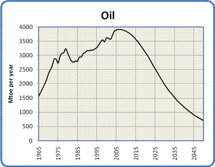
Figure 1:
Global Oil Production, 1965 to 2050
Keep in mind that
Peak Oil is primarily a transportation fuel problem. Almost 70%
of the world's oil is used in transportation as gasoline, diesel fuel,
jet fuel and bunker fuel for ships. Right now there is a lot of
excitement surrounding the development of electric cars. However,
the immediacy of the peak and the slope of the following decline
suggest that it may prove difficult to replace enough of the global
automobile fleet in the time available to maintain the ubiquitous
personal mobility we have become used to. Europe and Asia are
placing a lot of emphasis on electrifying inter-city rail and urban
mass transit. Rail electrification seems like a sensible
initiative that should
be pursued urgently by all nations.
Natural
Gas
The
supply situation with natural gas is very similar to that of oil. This
similarity makes sense because oil and gas come from the same
biological source
and tend to be found in similar geological formations. Gas and oil
wells are drilled using very similar equipment. The differences between
oil and gas have everything to do with the fact that oil is a viscous
liquid
while natural gas is, well, a gas.
While
oil and gas will both exhibit production peaks, the slope of the
post-peak decline for gas will be significantly steeper due to its
lower viscosity. To help understand why, imagine two identical
balloons, one filled with water and the other with air. If you set them
down and let go of their necks, the air-filled balloon will empty much
faster than the one filled with water. Even though oil and gas
reservoirs are made up of porous rock rather than being big pockets of
liquid or gas, they behave in much the
same way. Because
of its viscosity, oil reservoirs often require their internal
pressure to be raised over time by pumping in water, in order to
force out the oil and maintain their flow rates. In contrast, when a gas reservoir is pierced
by the well, the gas flows out rapidly under its
own pressure. As the reservoir empties the flow can be kept relatively
constant until the gas is gone, when the flow will suddenly stop.
Gas
reservoirs show the same size distribution as oil reservoirs. As with
oil, we found and drilled the big ones, in the most accessible
locations, first. The reservoirs that are
coming on-line now are getting progressively smaller, requiring a
larger number of wells to be drilled to recover the same volume of gas.
For example, the number of gas wells drilled in Canada between 1998 and
2004 went
up by 400% (from 4,000 wells in 1998 to 16,000 wells in 2004),
while the annual production stayed constant. These considerations mean
that the
natural gas supply will exhibit a similar bell-shaped curve to what we
saw for oil. In fact, the production of natural gas peaked in the
United States in 2001, and in Canada in 2002. In addition, the
remaining large gas and oil deposits are in less and less accessible
locations, making the extraction of their reserves slower and more
expensive.
One
other difference between oil and gas is the nature of their global
export markets. Compared to oil, the gas market is quite small
due to the difficulty in transporting gases compared to liquids.
While oil can be simply pumped into tankers and back out again, natural
gas must first be liquefied (which takes substantial energy),
transported in special tankers at low temperature and high pressure,
then re-gasified at the destination which requires yet more energy. As
a result most of the world's natural gas is shipped by pipeline, which
pretty well limits gas to national and continental markets. This
constraint has an
important implication: if a continent's gas supply runs low it is very
difficult to supplement it with gas from somewhere else that is still
well-supplied.
The
peak of world gas production may not occur until 2025, but two things
are sure: we will have even less warning than we had for Peak Oil, and
the subsequent decline rates may be shockingly high.
I have chosen 2025 as the global peak (20 years after Peak Oil).
The peak is followed by a rapid increase in decline to 10% per year by
2050, for an average decline rate of 6% per year.
In 2050 gas production is projected to be only 24% of its current
value. The production curve for natural gas is shown in Figure 4.
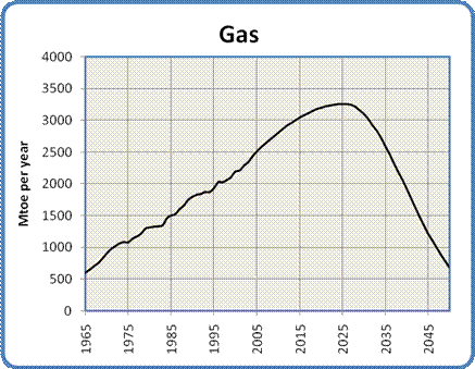
Figure 4: Global Natural Gas
Production, 1965 to 2050
One of the big
concerns regarding a decrease in global natural gas supplies has to be
about its role in the production of ammonia for fertilizer.
Currently 4% of the world's natural gas is used for fertilizer
production (the largest uses are as industrial and residential heat
sources, and for electricity generation). As the gas supply
declines the price will automatically rise and fertilizer prices will
go along for the ride. Rising fertilizer prices will have dire
consequences in a
world whose expanding population needs to be fed, where much of the
land would not be able to sustain its current production levels without
artificial fertilizer, and where the largest population
increases will occur in the poorest nations with the least productive
soils.
It is possible to produce the hydrogen required to make ammonia (the
feedstock for most fertilizer) from other sources - coal and
electrolysis are often mentioned. There are substantial risks
associated with those approaches, though. The cost of hydrogen
from alternative sources is still considerably higher than for hydrogen
made from
methane, pricing any resulting fertilizer out of the reach
of those who need it most. Making hydrogen from coal will
also generate greenhouse gases as the carbon is burned for process
heat. Electrolysis depends on having cheap sources of surplus
electricity available, electricity that is not being used for higher
priorities. As will become clear below, there is a strong
posibility that such surpluses will never materialize, especially if
the natural gas currently being used for electricity generation needs
to be replaced by other sources.
Oil
and Gas Combined
Oil and
natural gas are the world's primary fuel sources, used for both
transportation and heat. Together they supply a full 60% of the
energy currently used by humanity. According to this model, their
combined energy peak will come in 2012, at 6679 Mtoe. By 2050
they will be producing a combined energy of only 1386 Mtoe. This
represents a drop of 80%.
To the extent that we cannot replace this shortfall through novel uses
of electricity from other sources, this decline represents an
enormous challenge. It is a challenge that seems destined to
alter the fundamental shape of our civilization over the next three or
four decades.
Coal
Coal
is the ugly stepsister of fossil fuels. It has a terrible environmental
reputation, going back to its first widespread use in Britain in the
1700s. London's coal-fired "peasoup" fogs were
notorious, and damaged
the health of hundreds of thousands of people. Nowadays the concern is
less about soot and ash than about the acid rain, mercury and
especially carbon dioxide that results from
burning coal. For the same amount of energy released, coal produces
more CO2 than either oil
or gas. From an energy production standpoint coal has the advantage of
very great abundance. Of course that very abundance is a huge negative
when
considered from the perspective of global warming.
Most
coal today is used to generate electricity. As economies grow, so does
their demand for electricity. The need to use electricity to
replace
some of the energy lost due to the decline of oil and natural gas will
put yet more upward pressure on the demand for coal. At the moment
China is installing two to three new coal-fired power plants per week,
and has plans to continue at that pace for at least the next decade.
Just
as we saw with oil and gas, coal will exhibit an energy peak and
decline, though for different reasons. One important factor in the
eventual decline of the energy obtained from burning coal is that we
have in the past concentrated on
finding and using the highest grade of coal: anthracite. Much
of what
remains consists of lower grade bituminous and lignite. These grades of
coal produce less energy when burned, and require the mining of ever
more coal to get the same amount of energy.
In
addition to their exemplary study of oil supplies mentioned above, the
Energy
Watch Group has also conducted an extensive analysis
of coal use over
the next century. I have adopted their "best case"
conclusions for this model. The model projects a continued rise in
the use of coal to a peak in 2025. As global warming begins to have
serious effects there will be mounting pressure to reduce coal
use. Unfortunately, due to its
abundance and our need to replace some of the energy lost from the
depletion of oil and gas, the decline in coal use will not be as
dramatic as seen with those fossil fuels. The model has coal use
decreasing evenly from its peak to a production level similar to what
it is today, giving the curve shown in
Figure 5.
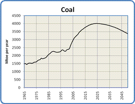
Figure 5: Global Coal Production,
1965 to 2050
Of
course the increased use of coal carries with it the threat of
increased global
warming due to the continued production of CO2. Many hopeful words
have
been written about the possibility of alleviating that worry by
implementing Carbon Capture and Storage. CCS usually involves the
capture and compression of CO2 from power plant
exhaust, which is then
pumped into played-out gas fields for long term storage. This
technology is still in the experimental stage, and there is much
skepticism surrounding the security and economics of storing such
enormous quantities
of CO2 in porous rock
strata.
Hydro
If
coal is the ugly stepsister, hydro is one of the fairy godmothers of
the energy story. Environmentally speaking it's relatively clean, if
perhaps not quite as clean as once thought. It has the ability to
supply large amounts of electricity quite consistently. The technology
is well understood, universally available and not too technically
demanding (at least compared to nuclear power). Dams and generators
last a long time.
It has
its share of problems, though they tend to be quite localized.
Destruction of habitat due to flooding, the release of CO2 and
methane
from flooded vegetation, and the disruption of river flows are the
primary issues. In terms of further development the main obstacle is
that in many places the best hydro sites are already being used.
Nevertheless,
it is an attractive energy source.
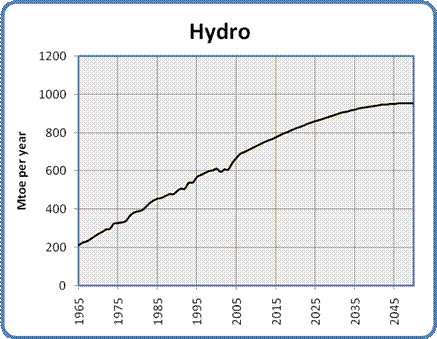
Figure 6: Global Hydro Production,
1965 to 2050
Development will probably continue
in the immediate future at a similar pace as in the past. The
model for hydro power has its capacity increasing by almost 40% by
2050. This projected growth is gradually constrained toward the middle
of the century by two main factors: most
useful river sites are already in use, and water flows will
gradually be reduced due to global warming. There
may also be a general loss of global
industrial capacity (and/or rising development costs) due to oil and
gas depletion. Nevertheless, the
pressure on hydro power to replace energy lost from oil and gas
depletion will support continued development even in the face of such
constraint.
Nuclear
The graph
in Figure 7 is a mix of data synthesis with a bit of projection.
I started with a table of reactor ages from the IAEA (reprinted in a
presentation to the Association
for the Study of Peak Oil and Gas), the table of historical nuclear
power production from the BP
Statistical Review of World Energy 2007 and a table from the Uranium Information Centre
showing the number of reactors that are installed, under construction,
planned or proposed worldwide.
The
interesting
thing about the table of reactor ages is that it shows the vast
majority of the world's operating reactors (361 out of 439 or 82% to be
precise) are between 17
and 40 years old. The number of reactors at each age varies of course,
but the average number of reactors in each year is about 17. The number
actually goes over 30 in a couple of years.
Two
realizations
formed the basis for my model of nuclear power. The first was that
reactors have a finite lifespan averaging around 40 years, which means
that a lot of the
world's reactors are rapidly approaching the end of their useful life.
The second realization was that the construction rate of new reactors
and their
average capacity can be inferred from the UIC planning
table. We
can
therefore calculate the approximate world generating
capacity with reasonable accuracy out to 2030 or
so.
The model
takes
a generous interpretation of the available data. It assumes we will
build all the reactors shown
in the UIC data referenced above: six plants
per year for the next five years, nine plants per year for the
subsequent ten years, and ten plants per year until 2050. The model
further assumes that all
reactors will be granted life extensions to 50
years from their current 40, and that no
plants will be prematurely
decommissioned. It also assumes that each plant generates an
average output equivalent to 1.53 Mtoe per year. The derivation of this
figure is
given in the model data available here.
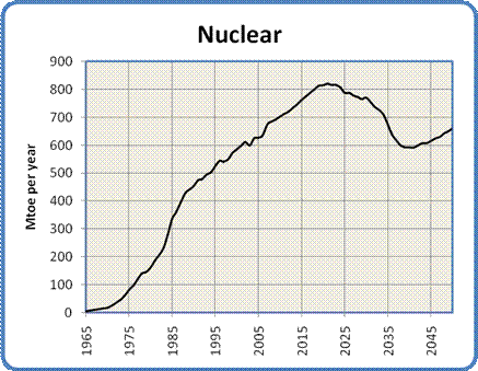
Figure 7: Global Nuclear Production,
1965 to 2100
The
drop in output between 2020 and 2037 is the result of new construction
not keeping pace with the decommissioning of old
reactors. The
argument for a peak and subsequent decline in nuclear capacity is very
similar to the logistical considerations behind Peak Oil - the
big pool of reactors we currently use will start to become exhausted,
and we're not
building
quite enough replacements. The rise after
2037 comes from my estimate that we will
then be building 10 reactors per year compared to 6 per year today. The
net
outcome is that in 2050 nuclear power will be supplying about the same
amount of energy that it is today.
A
number of factors may act to increase that output. Those changes
could
include the uprating of existing reactors to produce more power than
their original design specification, an increase in the size of future
reactors and/or a building boom prompted by concerns about global
warming and the decline of oil and gas supplies.
Restraining
the increase will be economic factors
(construction will become more expensive as oil and gas deplete,
driving up the cost of materials and transportation), and continuing
public opposition to nuclear power plants, waste storage and uranium
mining. At some point uranium mining itself may also become a
bottleneck - the current world production of about 50,000 tonnes of
uranium per
year could need to increase to around 70,000 tonnes per year in order
to fuel the increased number of reactors. Of course the amount of
additional uranium required will depend entirely on the number of new
plants that actually get built.
A
number of advanced reactor technologies are presently under
investigation or development, including high energy "fast
reactors" that produce less waste, reactors that can use more
abundant and cheaper thorium as a fuel, and "pebble bed"
designs that
promise improved safety. None of these technologies are
commercially available (and are unlikely to be within the next decade
or two), so they have not been incorporated into the model.
Renewable
Energy
Renewable
energy includes such sources as wind, photovoltaic and thermal solar,
tidal and wave power, biomass etc. Assessing their probable
contributions to the
future energy mix is one of the more difficult balancing acts
encountered in the construction of the model. The whole renewable
energy industry is still in its infancy. At the moment, therefore, it
shows little impact but enormous promise. While the global contribution
is still minor (at the moment non-hydro renewable technologies supply
about
1% of the world's total energy needs) its growth rate is exceptional.
Wind power, for example, has experienced annual growth rates of 30% over
the last decade, and solar power is doing about as well, though
from a lower starting point.
Proponents
of renewable energy point to the enormous amount of research being
conducted and to the wide range of approaches being explored. They also
point out correctly that the incentive is enormous: the development of
renewable alternatives is crucial for the sustainability of human
civilization. All this awareness, work, and promise give the nascent
industry an aura of strength verging on invincibility, which in turn
supports a conviction among its promoters that all things are possible.
Of
course, the real world is full of unexpected constraints and
unwarranted optimism. One such constraint has shown up in the field of
biofuels, where a realization of the conflict between food and fuel has
recently broken through into public consciousness. One can also see
excessive public optimism at work in the same field, where dreams of
replacing
the world's gasoline with ethanol and biodiesel are now struggling
against the limits of low net energy in biological processes.
The
key questions in developing a believable model are, what is the
probable growth rate of renewable energy over the
next 50 years, and what amount of energy will it ultimately
contribute? I do not subscribe to the pessimistic notion that
renewables will make
little significant contribution. However, I think it's equally
unrealistic to expect
that they will achieve a dominant position in the energy marketplace,
due to their late start and their continuing
economic disadvantage relative to coal.
In
order to project realistic growth rates for renewable energy sources I
have
used the same mathematical approach as I used for hydro. Data on recent
global
production of wind, solar photovoltaic and other forms of renewable
energy was used as the starting point for the
projections. Excel trend lines were fitted to the data and the
equations generated in the process were used to extrapolate the growth
of each source. As we saw previously, the closeness of the fits
as
demonstrated by the R-squared values on the graphs gives a
certain degree of confidence in
the projections.
These projections should be treated with a great deal of caution.
Because both the wind and solar power industries are still so new, it
is
possible that they may exhibit higher growth rates in the future, thus
making the following projections too conservative. On the other hand
they may run into unexpected constraints that would skew the
outcome in a more pessimistic direction. Due to the
youth of the industry there is very little historical production data
to use in establishing the trends. This scarcity of data makes
statistical
projections less trustworthy, as large discontinuities in production
from year to
year may render the curve fits unreliable. On the other hand,
there is at least some basis for the projections beyond the enthusiasm
of the proponents or the gainsaying of their detractors. The
projections should be regarded more as thought experiments - do they
seem reasonable given your own assumptions of how the energy world
works? If they seem unreasonable (either too high or too low),
what is the evidence that will dispute them?
Wind
Data
on the global
production of wind energy from 1997 to 2005, collected by the World Wind Energy
Association and reprinted in this
graphic, was used as the starting point for the
projection shown in Figure 8. The closeness of the fit of the
calculated curve to the actual production data, as indicated by the
R-squared value of .998, gives us a
reasonable degree of confidence in
the projection.

Figure 8: Actual and
Projected Wind Power, 1997 to 2050
There are a number of
factors that may act on the future development of wind
power. There is no doubt that it is an attractive replacement for
coal or gas-fired electricity generation, at least within the limits
imposed by the inherent variability of wind power. If that
limitation can be addressed, either through cheaper energy storage
techniques to bridge periods of low wind or smart grids that can
tolerate larger amounts of variable power, a significant constraint to
rapid and extensive wind development may be removed. The other
potential constraint is the ever-present threat of oil and natural gas
depletion. The rising cost of oil and gas may drive the cost of
industrial
production of all kinds up sharply before wind power has achieved a
significant presence.
As in
the case of nuclear power there will be pressures to speed up
the development of wind power because of global warming and the
depletion of oil and gas, as well as restraining forces imposed by
economics, technical feasibility and perhaps some public resistance to
having turbines in their neighborhood.
All in
all, with a projected growth of 2200% from now until 2050 it looks as
though wind is the renewable energy source that will make the most
difference to the world's energy mix over the next 50 years.
Solar
Photovoltaic
The data for
actual solar photovoltaic production were compiled from here,
here and
here.
This time, a third order polynomial was used to project the historical
trend based on data from 1996 to 2006, and once again the fit is good
enough to give some confidence
that the observed trend is real. Though the
growth of solar power in percentage terms is spectacular (an increase
of 12,000% by
2050), given the lower starting point the contribution
of solar power in 2050 will amount to only half that of
wind. However, wind and solar technologies are different enough
in their application that this amount of solar
power should make a
dramatic difference in the lives of many around the world.
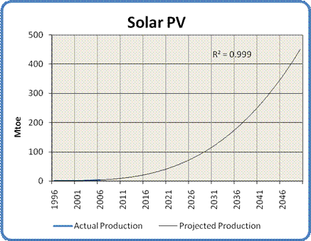
Figure 9: Actual and
Projected Solar Power, 1996 to 2050
Other
Renewables
In the category
of
"other renewables" we have such sources as geothermal, biomass, tidal
power etc. Production figures for these sources were obtained from
the Energy
Information Agency. After removing the contribution of wind
power from the aggregated figures, the historical production was again
projected mathematically. In this case a linear trend line provided the
best fit, which seems sensible - biomass is the largest contributor,
and it is a very mature energy source, unlikely to exhibit exponential
growth in the near future.

Figure 10: Other Renewable Energy
Production, 1990 to 2100
Putting
the Energy Sources in Perspective
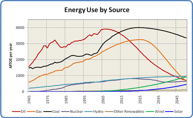
Figure
11: Energy Use by Source, 1965 to 2100
Figure
11 shows all the above curves on a single graph, giving us a sense of
the relative timing of the various production peaks as well as the
rates of increase or decline of the different sources. As
you can see, fossil fuels are by far the most important contributors to
the world's current energy mix, but oil and natural gas will decline
rapidly
over the coming decades. By the middle of the century the dominant
player
is coal, with oil, gas, hydro, nuclear power and renewables making very
similar contributions to the world's mid-century energy
supply.

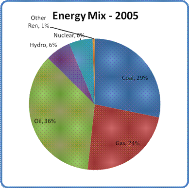

Figure 12: The Global Energy Mix in
1965, 2005 and 2050
Figure 12 shows
the changing contribution of each energy source relative to the others
over time. There are three interesting things to
note about this progression.
The first is the large role that
coal plays in the global supply picture. That situation is not
entirely
unexpected, but it hints at the difficulty we will have trying to
replace our dirtiest and most dangerous energy source as our supplies
of oil and gas decline.
The second is the increasing diversity of energy sources over
time.
This change is a good thing, as it indicates that various regions will
have a
much wider range of energy options available to them than in the
past.
Finally, by
mid-century energy sources that do not
generate greenhouse gases may be supplying 40% of the world's power as
opposed to 13% today and only 5% in 1965. Combined with an
overall (albeit
involuntary) reduction in global
energy use by 2050, that shift bodes well for reducing
the carbon dioxide our civilization exhales into the atmosphere.
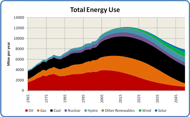
Figure 13: Total Energy Use, 1965 to
2100
Figure
13 has all the energy curves added together to show the overall shape
of total world energy consumption. This graph aggregates all the rises,
peaks and declines to give a sense of the complete energy
picture. The graph shows a strong peak in about 2020, with an
ongoing
decline out to 2050. The main reason for the decline is the loss of
oil and gas. The decline is cushioned by an
increase in hydro and renewables over the middle of the century, and
averages out to 1% per year.
Fuel
vs. Electricity
The energy we use can
be broadly categorized into two classes, fuel and electricity.
The former consists of oil and gas, the two sources that will be in
decline over the next half century. The amount of electricity we
produce from all other sources including coal will increase, though not
enough to offset the decline in fuels in terms of the energy they
supply. Figure 14 shows show how the split between the two
classes of energy will change over the next 45 years.
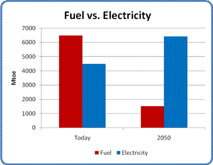
Figure 14: Fuel and Electricity Use,
Today and 2050
In
addition to the loss of transportation mobility it represents,
the loss of the enormous contributions of oil and natural gas means
that the
total amount of energy available to humanity by the middle of the
century
may be only 70% of the amount we use
now. That shortfall contains an
ominous message for our future that is the subject of the next section.
The
Effect of Energy Decline on the World's Population
World
Population Estimate
In order to
assess the impact of declining energy supplies on the world's
future population, we first need to establish what that population will
be.
In the past
I have argued that a drastic reduction in the world's population
was likely over the course of the coming century.
That expectation was based on my estimate of the impact of energy
shortages, fresh
water depletion, soil fertility depletion, the decimation of oceanic
fish stocks, pollution, biodiversity loss, climate change and economic
disruption. It is very hard to make that case, however - not
because the problems I list
aren't apparent, but because the causal links to
human population decline are very difficult to establish conclusively.
Accordingly,
for this analysis I have adopted the generally accepted population
projection published by the United Nations: a decreasing rate of growth
to a population of about 9 billion in 2050. This projection is known as
the Medium
Fertility Case. As you can see from the graph in Figure 15 it
matches perfectly with the projected trend of actual population growth
over the last 20 years.
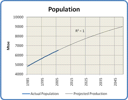
Figure 15: Actual and projected
World Population Growth, 1985 to 2050
The
Effect on Average Per Capita Energy
One of
the interesting, though very high-level, ways to measure of global
wealth is to calculate the average energy available to each person on
earth. While the resulting per capita average doesn't reflect the
disparity between rich and poor individuals or nations or let us know
what sorts of things people might do with their energy endowments, it
can give us a general feeling for how "energy-wealthy" the average
global citizen is, especially compared to other times.
Fortunately,
the energy analysis we have just completed gives us the tool we need to
establish this measure. By simply dividing the total energy
available in each year by that year's population we can construct the
graph shown in Figure 16.
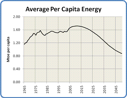
Figure 16: Global Average Per Capita
Energy Consumption, 1965 to 2050
As you can see, the rising population and falling energy
supply combine to produce a falling per capita energy
curve. In fact, if these models of energy and population are
correct, we can expect to see a drop of almost 50% in average per
capita
energy by 2050, from 1.7 toe/person to 0.9 toe/person. Each
person alive in 2050 will have available, on average, only half the energy they would have
today.
The Effect on Countries
Unfortunately the world is not a uniform place, and measures
like "average per capita energy" don't really tell us much about how
the world might look in 2050. To gain a bit more insight it is
helpful to think of the world as being composed of rich and poor
nations, where their wealth is characterized by their total energy
consumption and whose population growth is expressed in their Total
Fertility Rate.
An interesting insight appears when you sort the world's
nations
by their per capita energy consumption. The nations and regions
at the bottom
of the consumption scale (Africa, Bangladesh, India, Pakistan, Peru,
Indonesia and much of Southeast Asia) all have very high fertility
rates, well over the replacement rate of 2.1 children per woman.
In fact, when normalized for population size, the average TFR of the
poor nations is 3.0. In contrast, the group containing all the
other nations is well below the replacement fertility rate at around
1.8.
The implication is that poor nations are going to
face double jeopardy. Their populations will increase even as
their
already low energy consumption drops further. In addition,
as per capita energy consumption drops world-wide, some nations that
are not currently considered "energy-poor" will be impoverished enough
to join the group at the bottom, thereby swelling its ranks even
further.
The Growing Divide Between Rich and Poor
In order to get some idea of the magnitude of this effect, I
have associated each of the 63 countries or regional groupings in this
analysis with their current population, total current energy
consumption and their population in 2050. I have arbitrarily
decided that a per capita consumption of 0.75 toe/yr is the dividing
line between between poverty and wealth. 0.75 toe/yr is a bit
less than
half the present world average, and only one tenth of the energy
consumed by an average American.
The countries and regions that currently fall below that
poverty line
include Bangladesh, Philippines, Pakistan, India, Peru, Indonesia,
Ecuador, Colombia, Egypt, much of Africa, many Asian Pacific nations
and some Eurasian countries. Altogether they have a
population of about 3 billion people. The rest of the world's
nations, from Algeria to Kuwait, are in the rich half of 3.5 billion
people.
In order to assess the effect of declining average per capita
income, I decided to spread the pain evenly. The assumption is
that most countries will see a similar drop in their level of energy
consumption. While that expectation may not be completely
realistic, it
seems close enough for the purpose of this exercise. The result
is
that countries with a per capita consumption between 0.75 and 1.5
toe/person will lose enough energy to be counted in the group of poor
nations.
The countries and regions that drop from rich to poor status
include
Algeria, Turkey, Mexico, Thailand, much
of Central and South America, the non-oil-producing nations of the
Middle East, and - most significantly - China.
When we add up the populations
in 2050 of the rich nations
that are left, it comes out to only 1.6 billion. Remember, their
populations fell due to lower fertility, there are fewer of them and
they lost China to the ranks of the poor.
The population of the poor nations is where the shock
comes. Their total population in 2050 adds up to over 7 billion people. That
number is more
than the total population of the Earth today, all living at an energy
level somewhere between Bangladesh and Egypt.
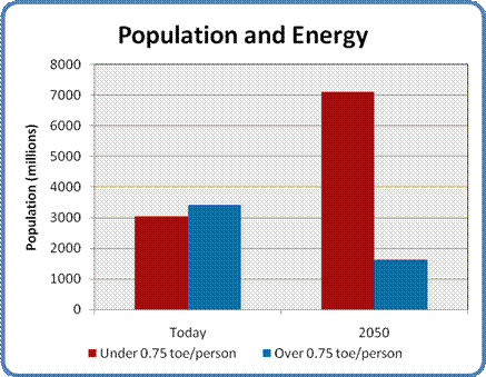
Figure 17: World Population at low
and high energy consumption levels, today and 2050
Conclusion
How
many
ways are there to say the world is heading for hard times? Losing
most of our oil is bad enough, and losing most of our gas as well
borders on the
catastrophic. Combining these losses with the exponential growth of
those nations that can least afford it is nothing short of
cataclysmic. The ramifications spread out like ripples on a
pond. There will be 7 billion people who will need fertilizer and
irrigation water to survive, but would be too poor to buy it even at
today's prices. Given the probable escalation in the costs of
fertilizer and the diesel fuel or electricity for their water pumps, it
isn't hard to understand why the spread of famine in energy-poor
regions
of the world seems virtually inevitable.
In normal times the poor would appeal to the rest of the world for food
aid. However, these times may be anything but normal. Even
the shrinking population of the rich world will see its wealth eroded
by the drop in energy supplies and the increasing cost of producing the
energy they do have. This decline in their wealth will in turn erode
any surpluses they might
otherwise have donated to international aid. In any
event, there will be over twice as many hungry mouths crying for that
aid, with less and less of it available.
This assessment doesn't even consider the converging and amplifying
impacts of the other
problems I mentioned above: the loss of soil fertility and fresh water,
the death of the oceans, rising pollution, spreading extinctions and
accelerating climate
change.
The solution to this dilemma, if solution there may be, does not seem
to lie in some Deus ex Machina or in a technological revision of the
parable of the loaves and fishes. If the dark visions outlined in
this article come true, we will be faced with a world in which the only
way forward is to accept that Mother Nature does not negotiate.
We must use our considerable intelligence to figure out ways to live
within the ecological budget we have been allotted. More than
that, we must change our values away from our current paradigm of
growth, competition and exploitation to one of sustainability,
cooperation and nurturing. The longer and tighter we cling to our
present ways, the more damage we will ultimately inflict on ourselves
and the world we live in. For many, the time for such a change
has
already passed. For a fortunate few there may yet be enough time
to move toward the new ways of living and being that will be required
in this brave new world.
October, 2007
|